


Make It In May
We held a virtual turning competition in May 2020 (as we couldn't meet face-to-face due to the Covid-19 coronavirus pandemic). The title was "Make It In May", and the theme was "Something to be hung". Here are the results.
The competition was judged independently and anonymously by Dave Gunner and Richard Peers. We were judging on four categories: Brief, Form, Function and Finish. The committee decided not to publish the scores, but to show the entry photographs and a summary of the judges' comments for each entry. We received a total of 9 entries.
| Member | Image | Judges' Comments | |||
|---|---|---|---|---|---|
| Brief | Form | Function | Finish | ||
| Dave Matthews | 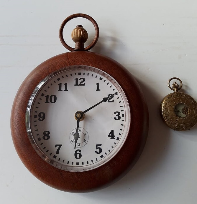 | The pocket watch/clock cross-over is an excellent idea, and pocket watches do hang from a chain. Actually making a chain would have been a great way to follow through on the concept. (RP) Brief well met in that it's a clock that can be hung on a wall. The only drop in points is for the interpretation and ingenuity as a wall clock is a safe option in my opinion. (DG) | It is a working clock movement, but I'm not sure how well it would hang on a wall from the top ring. Adding a concealed hanging point on the back might have been a better idea. (RP) It looks like a nice clock and although difficult to gauge the size completely it does appear to be a thick piece from what the photo shows. It would've been nice to see some patterns on the main body maybe pyrography or some form of carving/fluting as it's a very simple form.(DG) | I liked nearly everything about this piece, especially the execution of the knurled wheel at the top. However, the grain in the main body runs diagonally, which distracts slightly from the symmetry. (RP) The ring and dial on the top is a really nice touch and looks delicate compared to the main body. The form is quite plain and simple overall and aesthetically it is pleasing albeit a very simple shape. (DG) | The turning is very well executed, and really well finished too. Possibly, as pocket watches are generally made from precious metal, a shinier finish could have been used, but that's being picky. (RP) It's hard to tell but it looks like a matt finish has been applied and from what the picture shows it seems fine. (DG) |
| John Pedley | 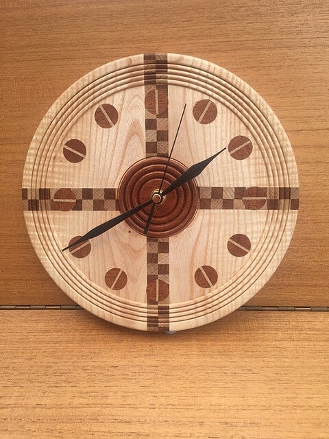 | Not just an ordinary clock, the use of different woods has lifted this piece to something more special. (RP) Brief well met in that it's a clock that can be hung on a wall. The only drop in points is for the interpretation and ingenuity as a wall clock is a safe option in my opinion. (DG) | A very pleasing clock, but the index marks at 3, 6, 9 and 12 o'clock are hard to see against the patterned background. A lighter wood for these would probably have worked better. (RP) It looks like a nice clock although difficult to gauge the size from the photos. The rings and inlays make a difference to the overall look. (DG) | It is great to look at, and I particularly like the evenly-spaced beads around the rim. However, if you inspect closely, some of the joints just fail to line up; it would be hard to prevent that, given how many there are. (RP) I do like the work they've done with the chequered inlays and dowels although I feel the dowels at 12, 3, 6 and 9 slightly spoil the chequered pattern and make it too busy. The rings are a nice touch and the hands go well with the overall look. (DG) | The turning looks crisp and clean, with no torn grain; it is hard to tell from the photos what final finish has been applied, but at least that means it doesn't stand out as being wrong! (RP) Picture quality doesn't show the finish in a good or bad light so straight down the middle with the score for this. (DG) |
| Graham Mee | 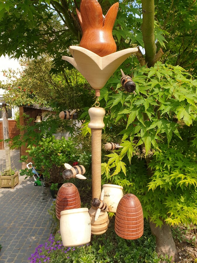 | This is a charmingly whimsical piece, using the full range of the brief to deliver a piece of great originality. (RP) Brilliant interpretation of a hanging item, it looks like a wind chime of sorts. Top marks for ingenuity with the central flower surrounded by bees and hives. (DG) | Hard to score this for functionality, as it has no obvious purpose beyond the amusement of the viewer. It does however achieve that very well. (RP) I think it looks great and couldn't be any more complex without overdoing it. (DG) | A highly entertaining piece, with so many intricate parts, all adding together to make an intriguing whole. The petals and sepals of the flower do look to be much too thick, though. (RP) I really like the composition with the flower as the centre piece and the hives at the base and bees at different levels buzzing around it. Proportions are not lifelike but for the purpose of being decorative it works well for me. (DG) | The item is mostly well turned and finished; inside the flower there looks to be some torn grain, which could have been sanded back. (RP) My only critique here is there are holes at the end of each leaf which are not clear on their purpose. The finish inside the flower looks less than the outside. The hook to hang is somewhat crude and could've been thought out like a wooden stamen or something similar. (DG) |
| Nick Laking | 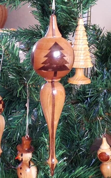 | A relatively simple concept, but pushed further by the inclusion of the Christmas tree pattern within the ornament body. (RP) Very well in terms of an item that hangs although like the clock somewhat of a safe option. (DG) | The shape, size and colour are all spot on for a Christmas tree bauble. If it is solid, then it could be a little heavy for the tree to bear. (RP) Again, it's difficult to judge as it looks quite large but I think that may be due to a close up picture. I think the segmented inlays are done really well and line up perfectly making a nice ornament. (DG) | The turned form is really good, although the top finial is a bit large when compared to the bottom one. The contrasting wood pattern is excellent. The Christmas tree pattern is not quite perfect, though. (RP) I love the shape of this with the sphere top and the teardrop bottom piece looking as though it's just dripping down, it flows really nicely. (DG) | Just the right amount of sheen for the purpose. However, some of the end grain pores have not been filled on the darker wood in the tree pattern. (RP) It looks as though it has a gloss finish and seems to be well done. (DG) |
| John Buck | 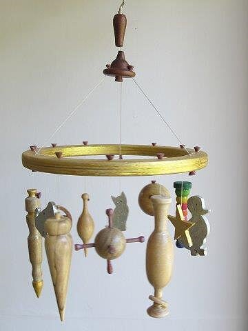 | A child's mobile is a fun project; novel use has been made of scroll-saw work to embellish the piece. (RP) Brilliant interpretation of a hanging item in the shape of a cot mobile. (DG) | After a lot of good work, the final assembly has let this down a little. The top hub hangs slightly off centre, and the holes for the 9 mobiles are not quite aligned on the same circle. (RP) Nice job turning so many different elements The main ring looks as though it has been cut from plywood? (DG) | Generally, it is a pleasing form; three different mobiles have very similar pointy shapes, where more variety would have helped. (RP) It's nice to see the different shapes, items, colours and even different woods have been used in the construction. It would have looked better if the items were hung at different levels maybe alternating so they could be seen better. (DG) | Generally a good finish; the top two elements seem to be different from the rest, though. (RP) Not easy to tell from a photo but the finish looks a little rushed especially where the edges of the wood have not been sealed meaning you can see the laminations in the ply. (DG) |
| Adrian King | 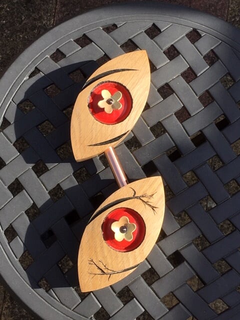 | An eye-catching and innovative piece, with lots to look at and ponder. Sadly, it is not at all obvious how it should or could be hung. (RP) I'm not entirely sure I know what it is or how it hangs as the picture shows it flat on the table. In terms of ingenuity the use of colour design and copper pipe gains the points. (DG) | This item has an elegant simplicity of form that belies its complexity to make. I really like the hand-painted branches. (RP) I really don't know what it is so I'm not sure?? (DG) | It is almost perfect in form; there is a slight difference in the flower shapes. (RP) I like the shapes and I really like the decoration with the additional colour I love the black accents and the trees and the additional copper pipe looks nice too. (DG) | Generally a good finish, but there seems to be some issue with the recesses the flowers sit in. (RP) It looks well finished in a matt/satin look and the colouring is well done I love the little yellow flowers too. (DG) |
| Peter Wade | 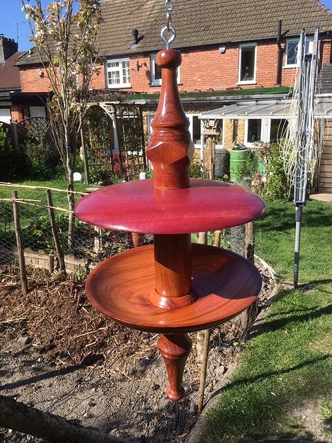 | A nicely-shaped bird feeder. (RP) Perfect a hanging bird feeder I really like this idea and the ingenuity comes from two dishes one upturned to form some shelter. (DG) | I like the idea of a roof to try and keep the food and birds dry - but with a saucer-shaped base, any rain that does make it in will puddle. I'm not sure about such a fancy piece for everyday garden use, either. (RP) I think it works well and I really like the concept. (DG) | I like the inclusion of the flat sides in the centre post, but otherwise it looks a bit chunky for the purpose. The timber selection is odd, too - several different species, but there is not enough of a colour contrast for this to work. (RP) The centre spindle could've been slightly slimmer to fit the dishes which are both well-made and this would have put the spindle in better proportion to the dishes, aside from that I really like the whole design and think it flows well apart from the thickness down the centre. (DG) | Very nicely turned and finished, with no obvious defects. I hope the finish used is both waterproof and has UV protection! (RP) Extremely well finished to a high gloss which brings out the purpleheart really nicely. (DG) |
| Neil Innes (winner) | 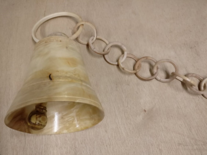 | I love the ingenuity of this - a turned bell, complete with clapper. To top it off, there is a chain of turned rings to hang it from. (RP) Really great idea, a bell hanging is outside-the-box thinking. I love the ingenuity of the added wooden chain. (DG) | I doubt it would ring forth like Big Ben, but as an ornament and discussion piece it hits the mark. (RP) I really like this one it's well done and the chain is brilliant. Even the hammer looks loose enough to swing free. (DG) | The chain is really well done, and the engineering of the bell clapper and its mounting demonstrate good problem solving skills. The bell looks a bit straight-sided to me. (RP) The pictures are quite close up so it's difficult to get a proper feel for the overall piece but it looks great from what I can see of it. (DG) | The bell is well-finished, but the chain looks drab and dull - a shiny finish would convey the idea of a metal chain much better. (RP) It looks like a satin/matt finish apart from the top piece which seems gloss but shows either tool marks or brush strokes. (DG) |
| Michael Newton | 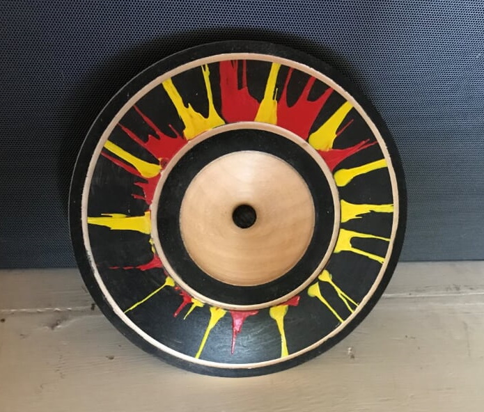 | A strikingly colourful wall plaque, with bold contrasts. The hanger looks like an after-thought, though. (RP) Nice wall hanging fairly simple shape colour adds to the overall appearance. (DG) | With coloured items, it all comes down to personal taste. I quite like this one, although letting the red and yellow paint run right up to the groove (and hence all stopping at the same point) doesn't look right. (RP) Hard to tell overall thickness from photo but as a wall hanging it's nice; more complexity in the turning would've taken it to the next level, for example some live edge, a different shape or maybe some additional texturing/carving. (DG) | It's a nice enough shape, with a good expanse of the underlying wood on show; the back has had a lot of good attention paid to it. The hole in the middle looks a bit rough, and suggests that it wasn't actually done on purpose. (RP) I really like the black background as it shows the red and yellow up better. The use of centrifugal force makes for interesting patterns and although a simple touch the black spot in the centre works well. (DG) | The finish is good, which is often hard to achieve over colouring without bleed. There is a small amount of black run-off or bleed into the outer groove, though. (RP) Finish is ok - some of the colours have leeched into the surrounding areas; this could be prevented by using a sanding sealer or even cutting back after the paint is dry. A few minor marks but overall it's good. (DG) |